Planny: a complex scheduling product, made simple before launch.
Planny generates shift schedules for hospital teams, under rest rules, skills and everyone’s wishes. The engine worked, but only its makers could read the product. For five months before going to market, I worked with the founders on what the product should do first, then redesigned the web app, designed an AI agent that proposes changes the planner approves, a mobile app for the team, and the design system behind them.
A smart engine, and a grid only its makers could read.
Heads of department plan a month for a dozen doctors, with day shifts, nights, weekends on call and leave. In the live product, all of it sat in one dense grid, and the planner had to check every cell before trusting the result.
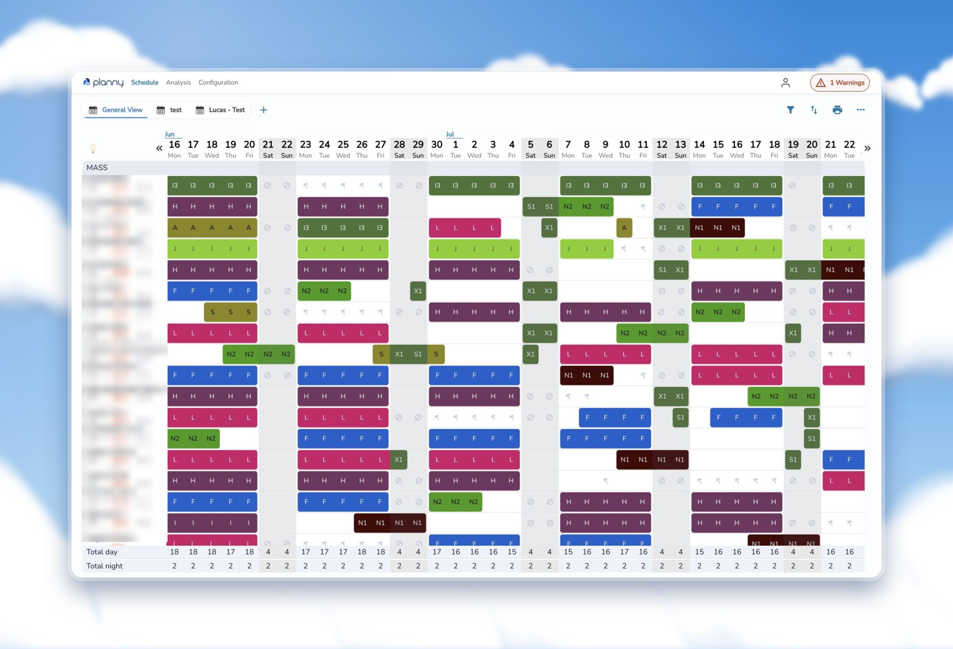 Before
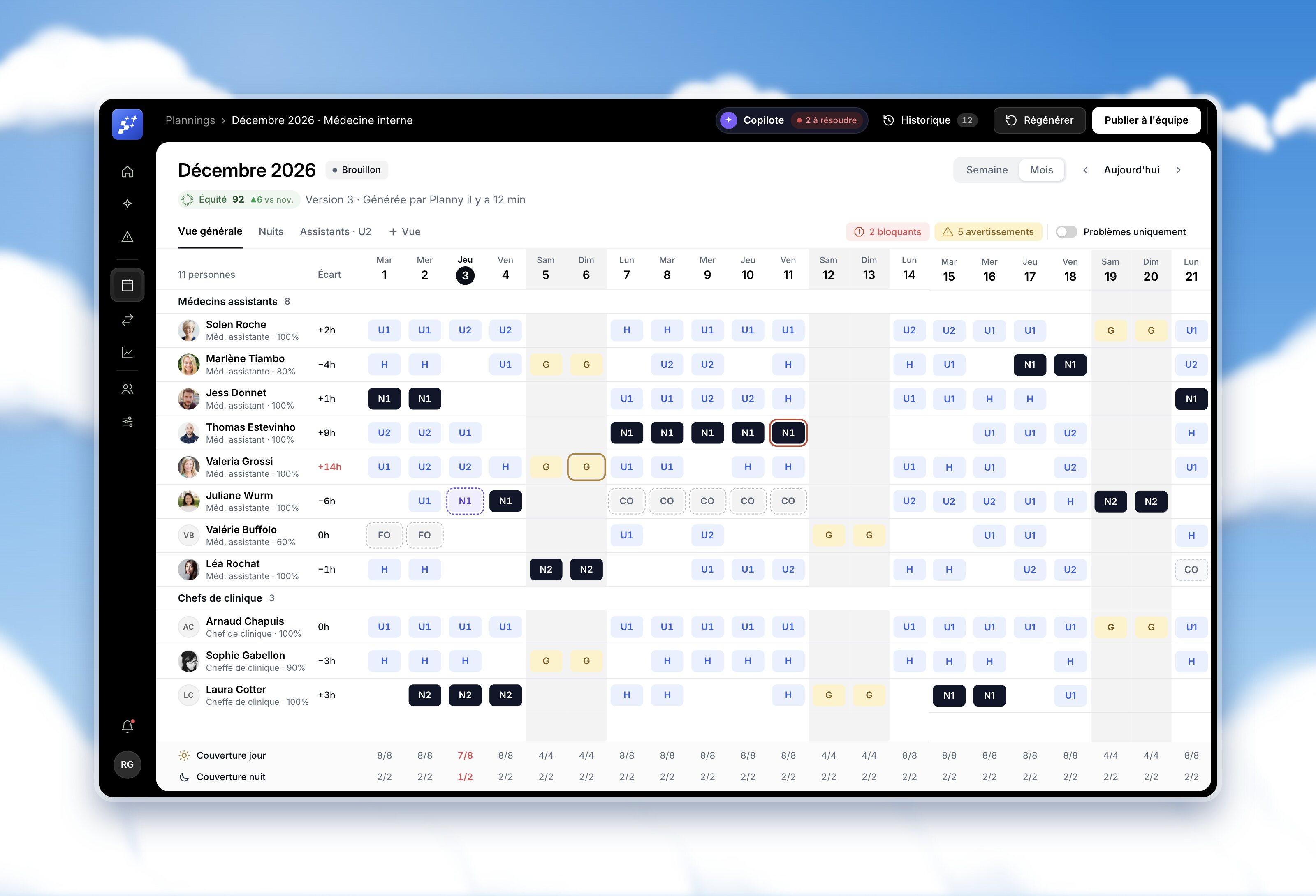 After
Twenty colours, no meaning
Every shift had its own colour, so nights, weekends and absences did not stand out from day shifts.
Problems behind one badge
A single “1 Warnings” button in the corner, and the planner had to hunt for the cell that caused it.
A rota with a hole in it.
When a missing night or a broken rest rule is found after publishing, the planner rebuilds the week by hand, and the team loses trust in the tool.
Before drawing screens, decide what the product is for.
Three days a month, I ran co-design workshops with the founding team. We listed what a planner actually does in a month, ranked it, and agreed to give each job its own screen instead of asking one grid to do everything:
- 1. Check and publish the month
- 2. Replace someone who calls in sick
- 3. Understand why a generation fails
- 4. Show that the rota is fair
- 5. Set up the team and its rules
The research mapped what the head of department needs from a rota: fair, compliant, quick to fix, easy to justify. But a rota is also the month of everyone in it. Three personas kept both sides in the room, and led to a second product: an app for the team.

“I want to trust the rota before I publish it.”
Dr Marc Favre, 58 · Head of internal medicine
Plans a month for a dozen doctors on top of his clinical work. He needs to see a broken rule at once, cover a sick call without redoing the week, and show management that the load is fair.
Issues surfaced before publishing
“I want my days off to count.”
Dr Léa Morel, 29 · Resident in internal medicine
Plans her life around the rota: a wedding, a course, a weekend away. She wants to ask for the days that matter, know in advance which ones are guaranteed, and see why a wish was not granted.
Wishes with a clear budget
“I want my fair share of nights, not more.”
Luca, 33 · Nurse, night shifts
Works days, nights and weekends on call. He wants to see that nights are shared evenly across the team, and to swap a shift with a colleague from his phone.
Swaps and fairness in viewOne job, one screen.
The grid stays at the centre of the product, but it no longer has to do everything. Problems come first, each department counts what matters to it, and fairness and the team setup get pages of their own.
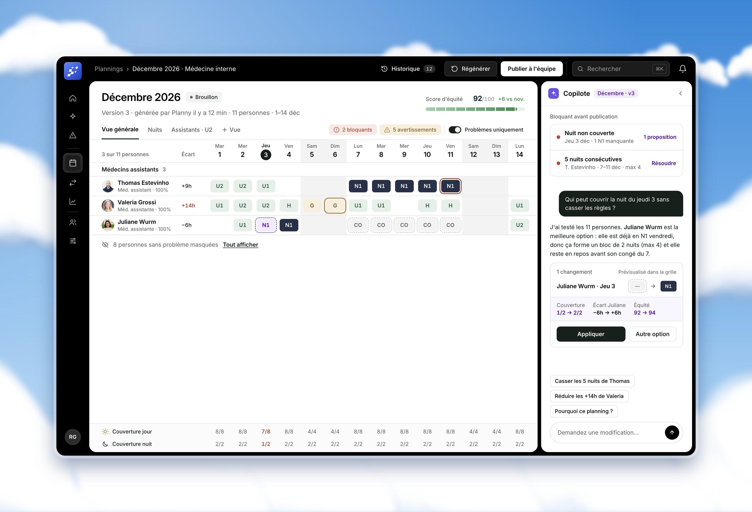
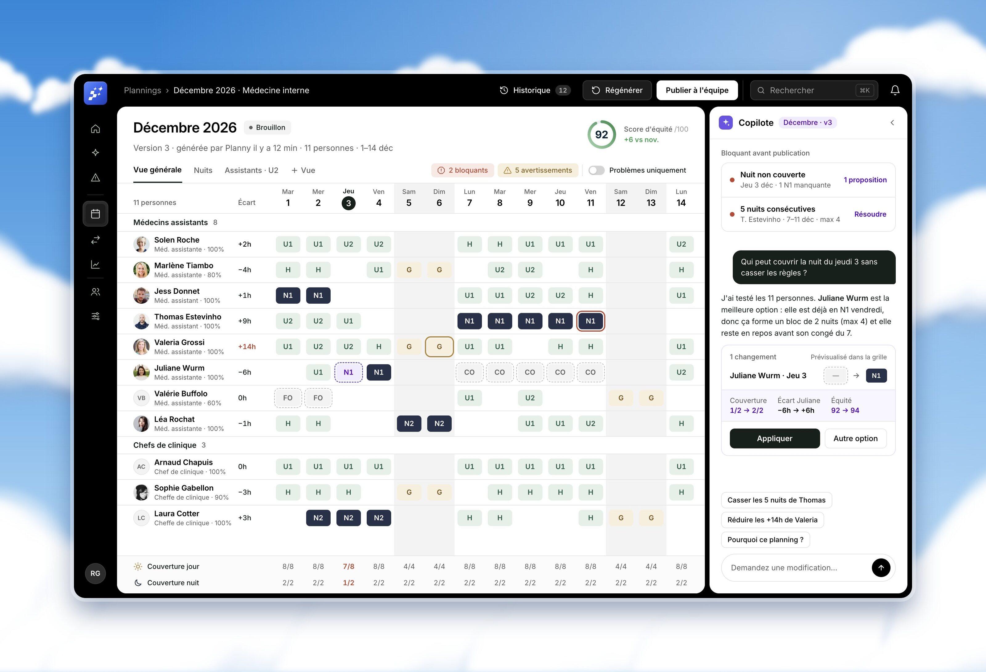
Check and publish: problems first
Blocking issues and warnings are counted above the grid, listed in the side panel and outlined in the cells. One switch hides everyone without a problem, so the planner fixes three rows instead of scanning eleven. Coverage for each day and night stays pinned at the bottom, and turns red where a shift is missing.
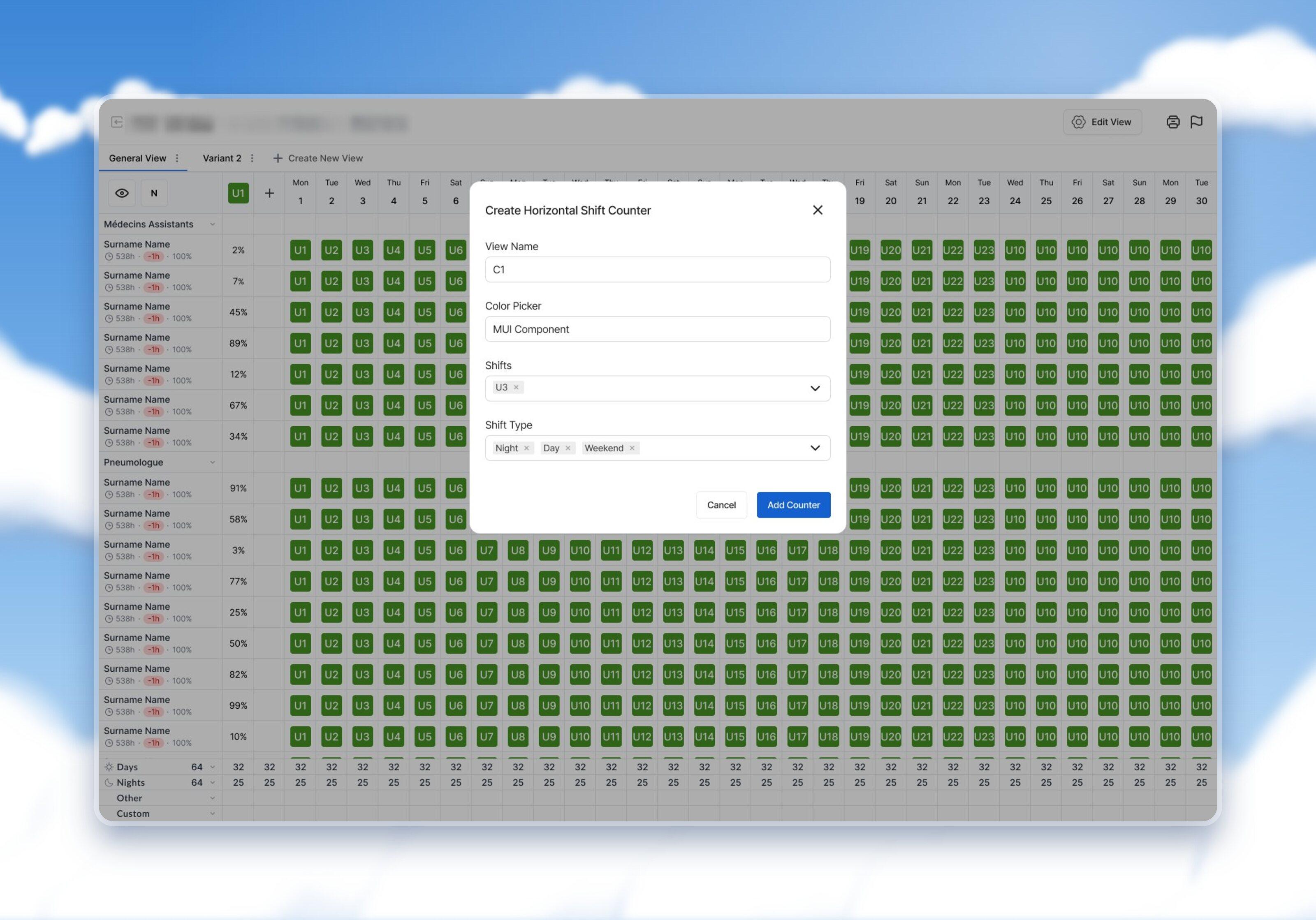
Views and counters for each department
Instead of adding columns for everyone, planners create their own views and shift counters: nights per person, weekends, hours. The hours counter shows what each balance is made of against the line of the contract, so the planner sees where a gap comes from before fixing it.
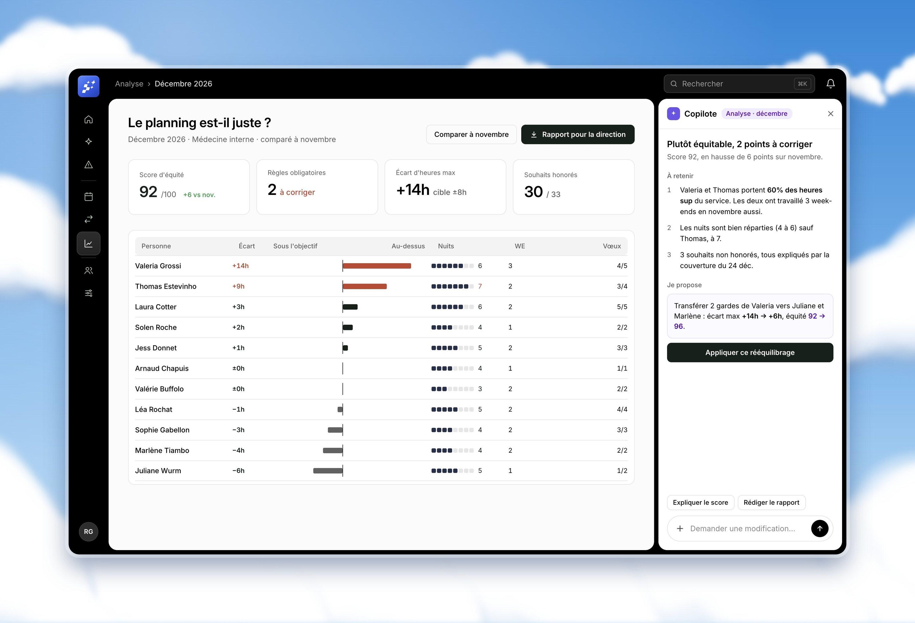
Fairness on one page
Fairness is what teams argue about. One page shows the fairness score, the gap in hours for each person, nights, weekends and wishes honoured, compared with last month. The report for management is one click away.
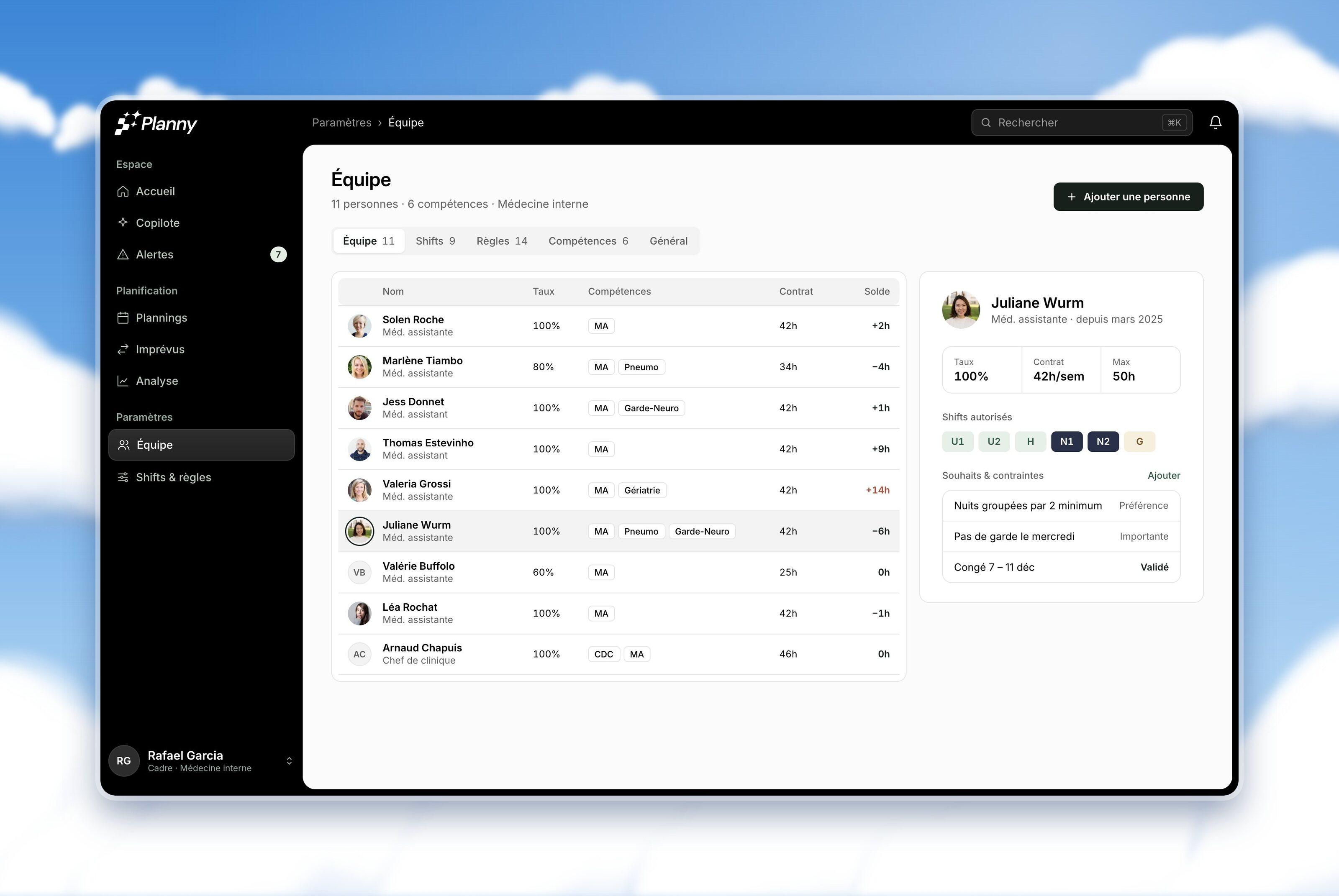
Rules set once, in the words of the ward
The team, its skills, contracts, allowed shifts and wishes live in one place. Everything the generation and the agent rely on is set here once, by the head of department, without a support call.
The AI proposes, the planner decides.
A head of department will not hand a rota to a black box. Before designing the agent, we set three rules with the founders on what it may do, and every screen follows them.
It proposes, never publishes
Every change is a proposal. Nothing moves in the rota until the planner clicks Apply.
It shows its effect
Each proposal comes with what it does to coverage, hours and fairness, previewed in the grid.
It has its own colour
Violet belongs to the AI and nothing else, so the planner always knows what a machine suggested.
A copilot next to every screen
The planner asks in plain words, such as “Who can cover Thursday night without breaking the rules?”, and the agent answers with one change, previewed in the grid in dashed violet, and its effect on coverage, hours and fairness.
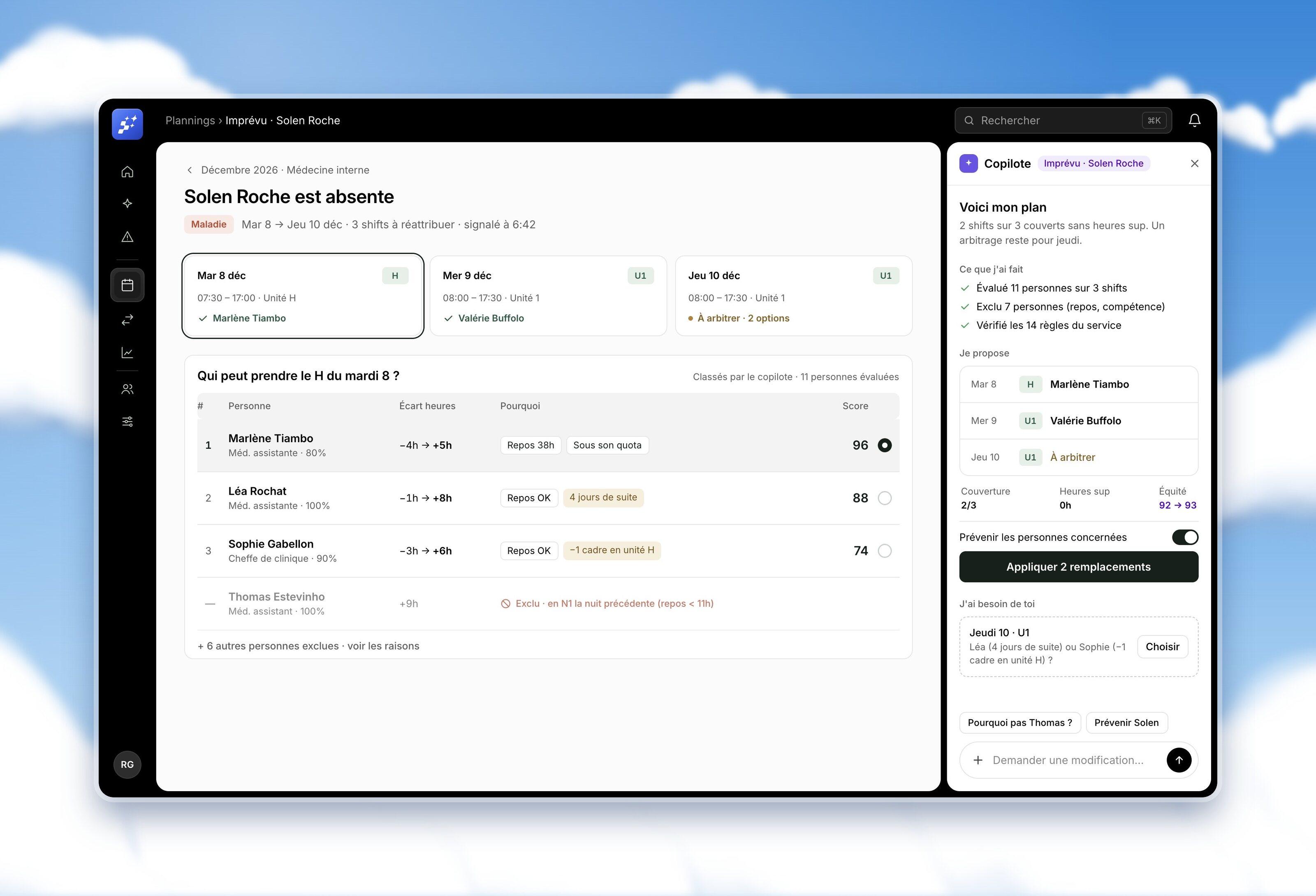
A sick call at 6:42, sorted before rounds
When someone calls in sick, the agent already has a plan: who can take each shift, ranked, with the reason in plain words, and who is excluded and why. The easy shifts are covered in one click. The one real trade-off is left to the planner, with both options side by side.
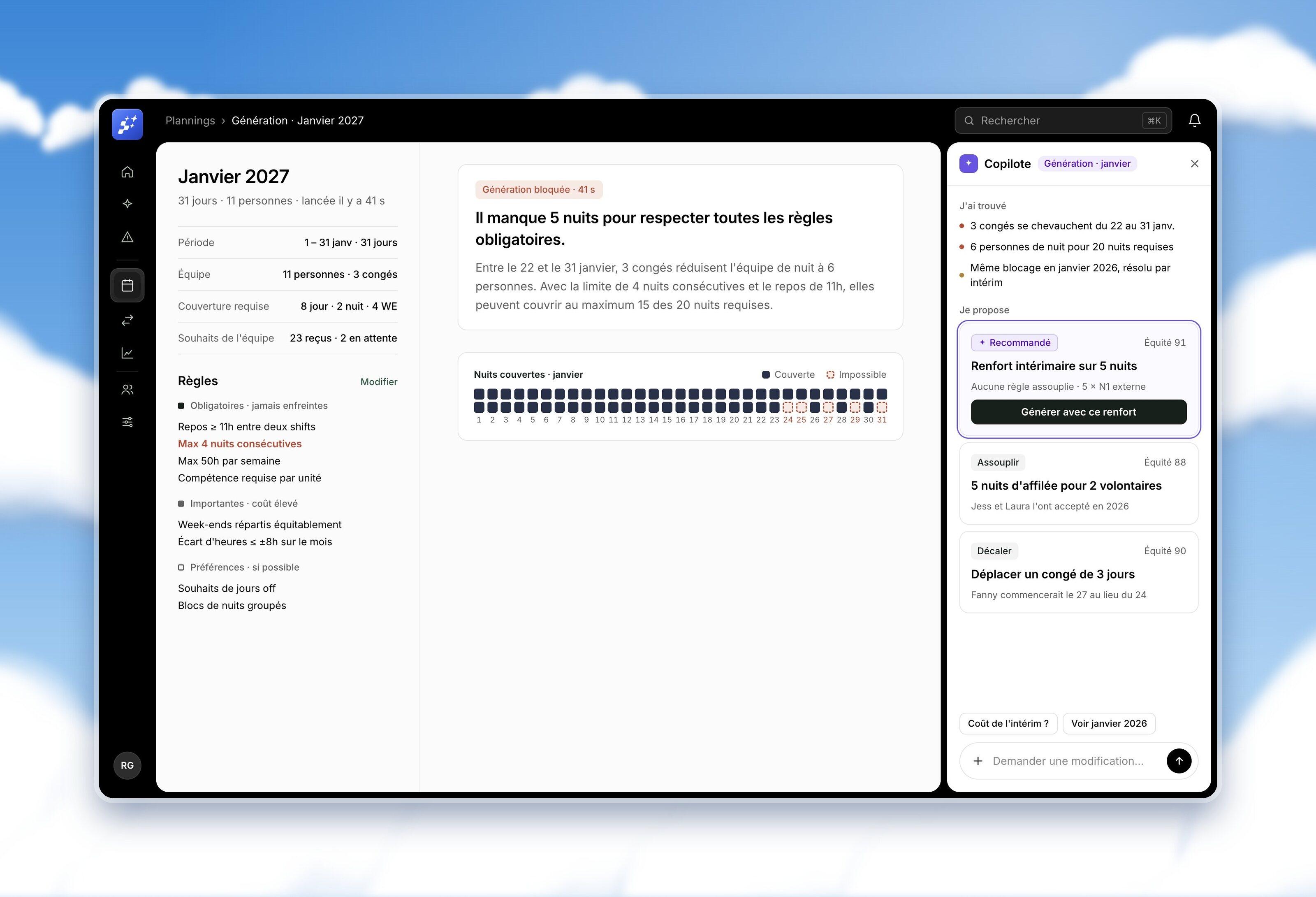
When the rota cannot be built, say why
A generation used to fail without explanation. Now it says what is missing: five nights, because three leaves overlap at the end of January. The agent offers three ways out, each with its fairness score: a temp for five nights, two volunteers, or moving a leave by three days.
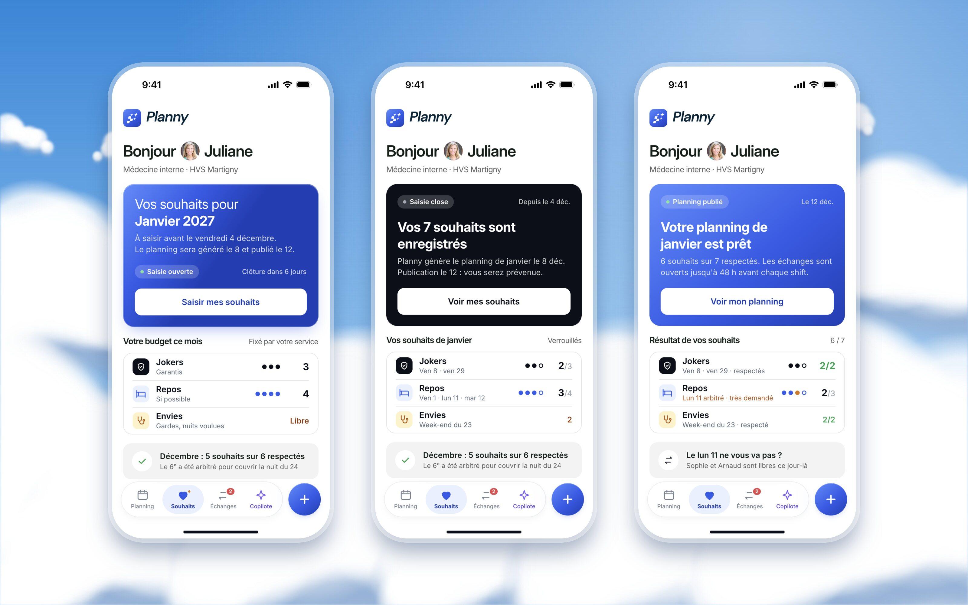
The team sends its wishes from the phone.
A rota is only as good as the wishes behind it. The doctors and nurses get their own mobile app, built around the three moments of every month: wishes open, wishes closed while the rota is generated, rota published with the result of each wish. Everyone has a budget set by their department: jokers are guaranteed days off, rest days are granted when coverage allows, and shifts people want to work are unlimited.
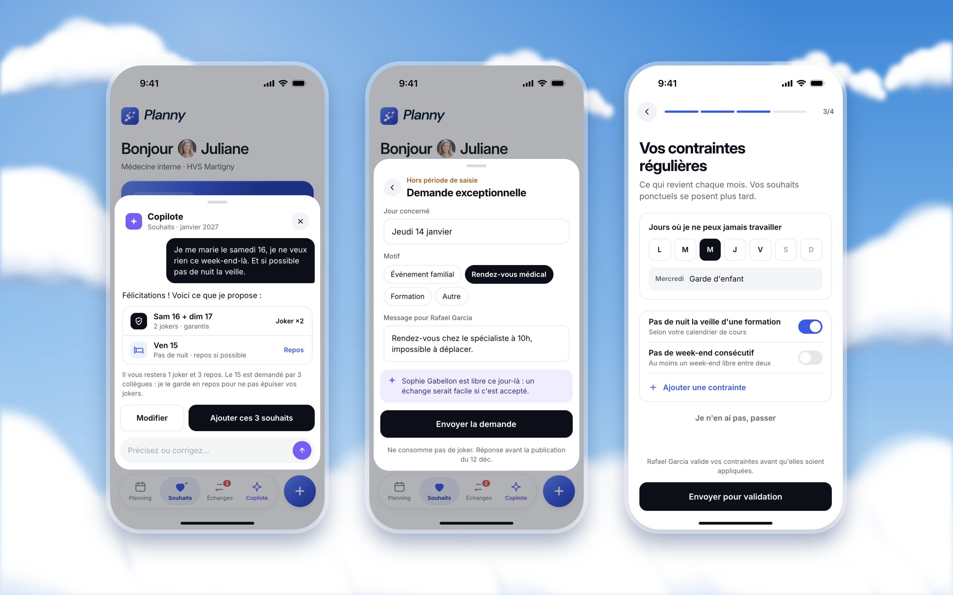
Joining takes under a minute. A full-screen welcome and three slides explain what the app is for, then the team code finds the department. The profile comes pre-filled, regular constraints are set once and sent to the head of department for validation, and notifications are limited to what matters. On the last screen, the wishes for next month are already open.
Entering a wish takes three taps: the day, the type, done. The budget stays in view, and the app warns when a day is already asked for by colleagues, so a joker is spent where it counts.
The agent works here too: “I’m getting married on Saturday the 16th, nothing that weekend, and no night the day before if possible” becomes two jokers and one rest day, with the reason it saves a joker. After the deadline, an exceptional request goes to the head of department with a free colleague already suggested.
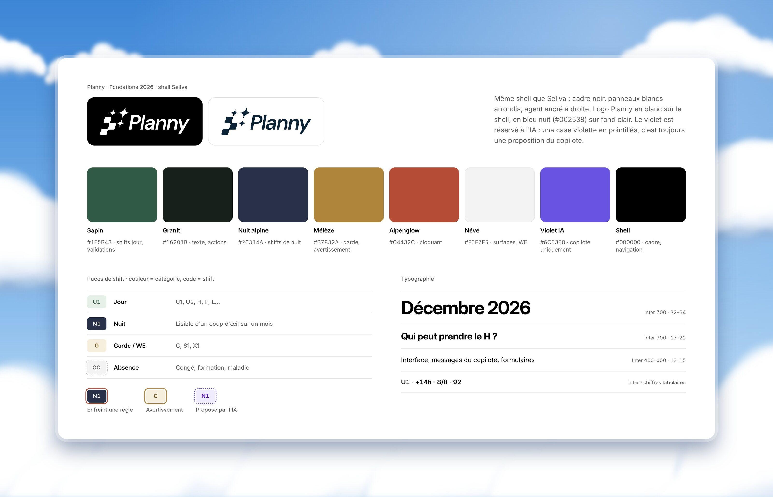
Four colours instead of twenty.
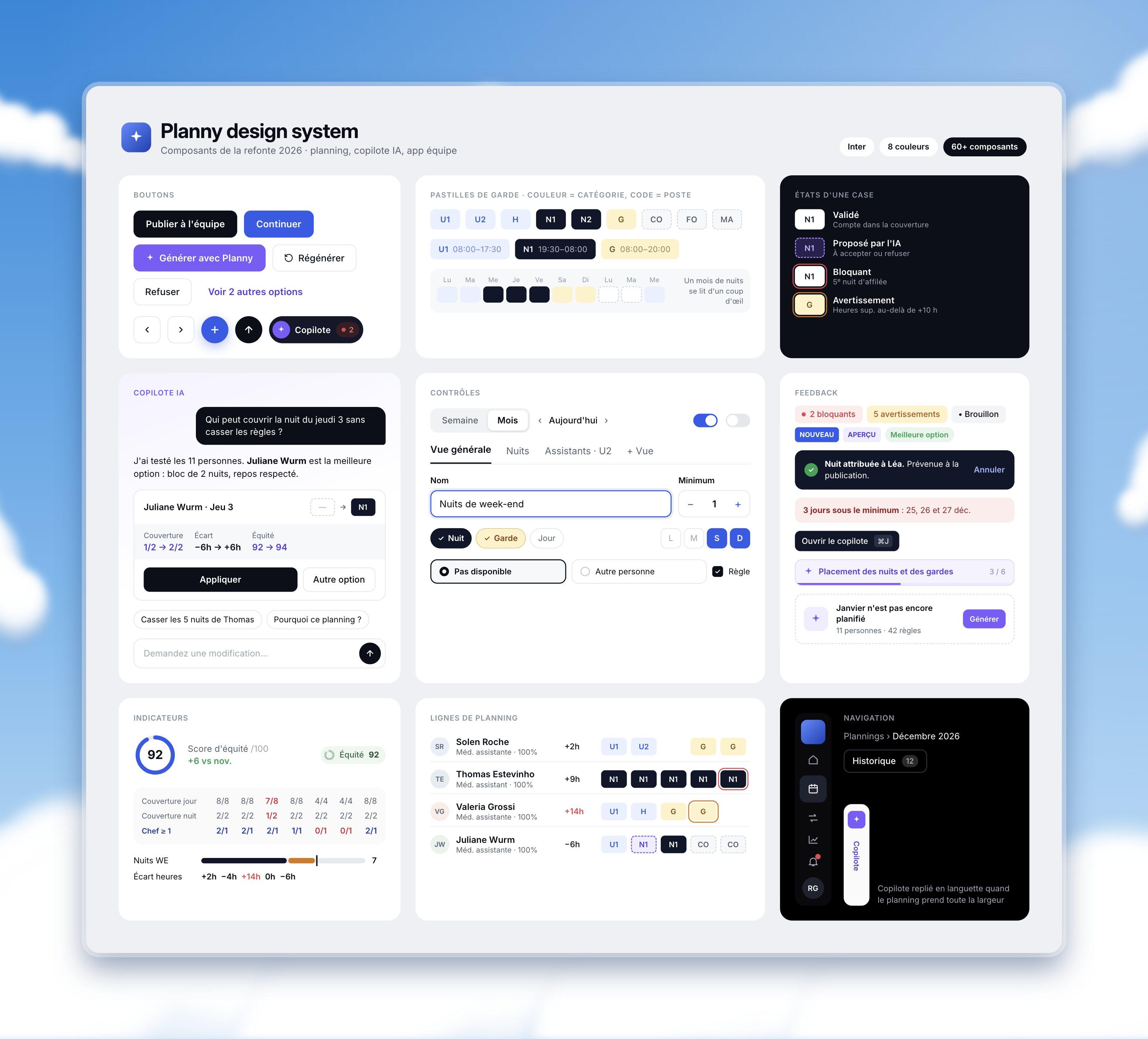
Colour now says the category and the code says the shift: Planny blue for day shifts, ink for nights, amber for on-call and weekends, a dashed outline for absences. A month of nights reads in one look. Three states sit on top of any chip: a red outline breaks a rule, an amber one is a warning, and a dashed violet one is always a proposal from the AI. The foundations, chips and type scale are set once and used across every screen.
Simplifying a complex product is a strategy job first.
Rank the jobs, not the features
Five jobs a month, one screen each. The features found their place once the jobs were clear.
One signal per meaning
Four colours instead of twenty, and three states on top. Simplicity came from removing meaning that clashed.
Put the AI where the work hurts
The agent takes the slow parts, sick calls and failed generations, and leaves the decisions to people.
More case studies
 Le TempsAI inside a newspaper, without spending its trustRead the case study
 PlannyA complex scheduling product, made simple before launchRead the case study
 Mercedes-BenzTurning idle cars into shared mobilityRead the case study
 FoodhackFrom a blank page to a live investment platformRead the case study
 Dentsply SironaTaking dental orders from paper to a platformRead the case study